Design goal
Redesign the navigation and browsability of Shindigz.com to enable successful product discovery & location.
PROBLEM TO SOLVE:
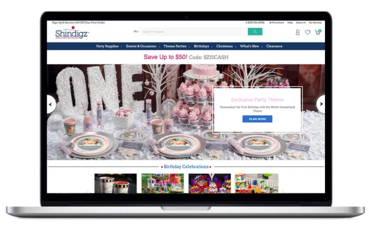
An E-commerce party planning portal Shindigz.com had an offering of 1000s of party supplies and some interesting themes, but it lacked a website experience that made it actually usable, allowing users to find the right party product of choice that meets their needs.
Outcomes
During contexual inquiry, came upon a clear 'LIGHTBULB MOMENT' - Shindigz revealed itself as a player with the most unique themes, and 100s of them. The web brand offering was based off of that, and thus the design of the navigation and browsability of the products.
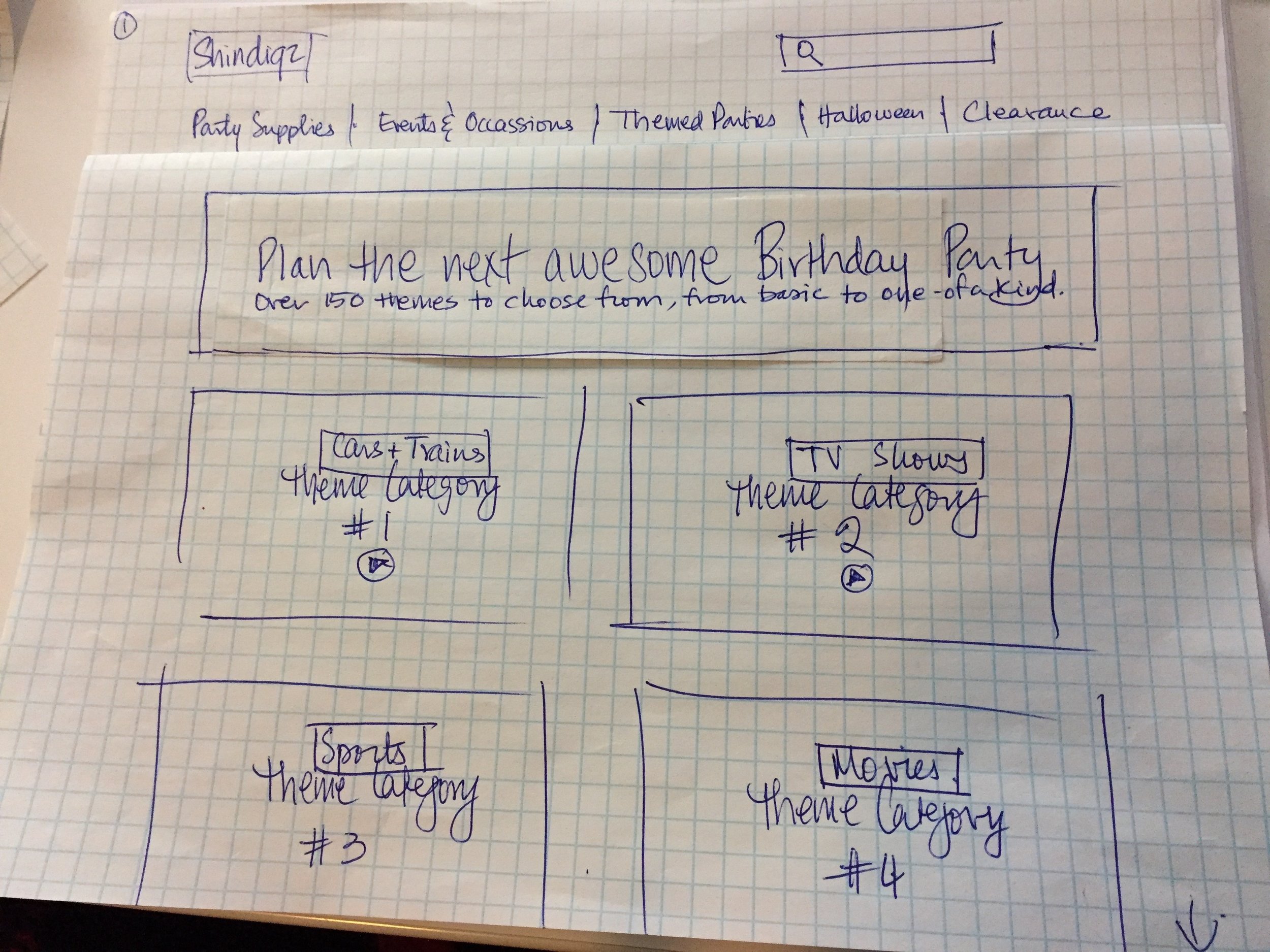
Clear navigation model to search by theme, product or occasion
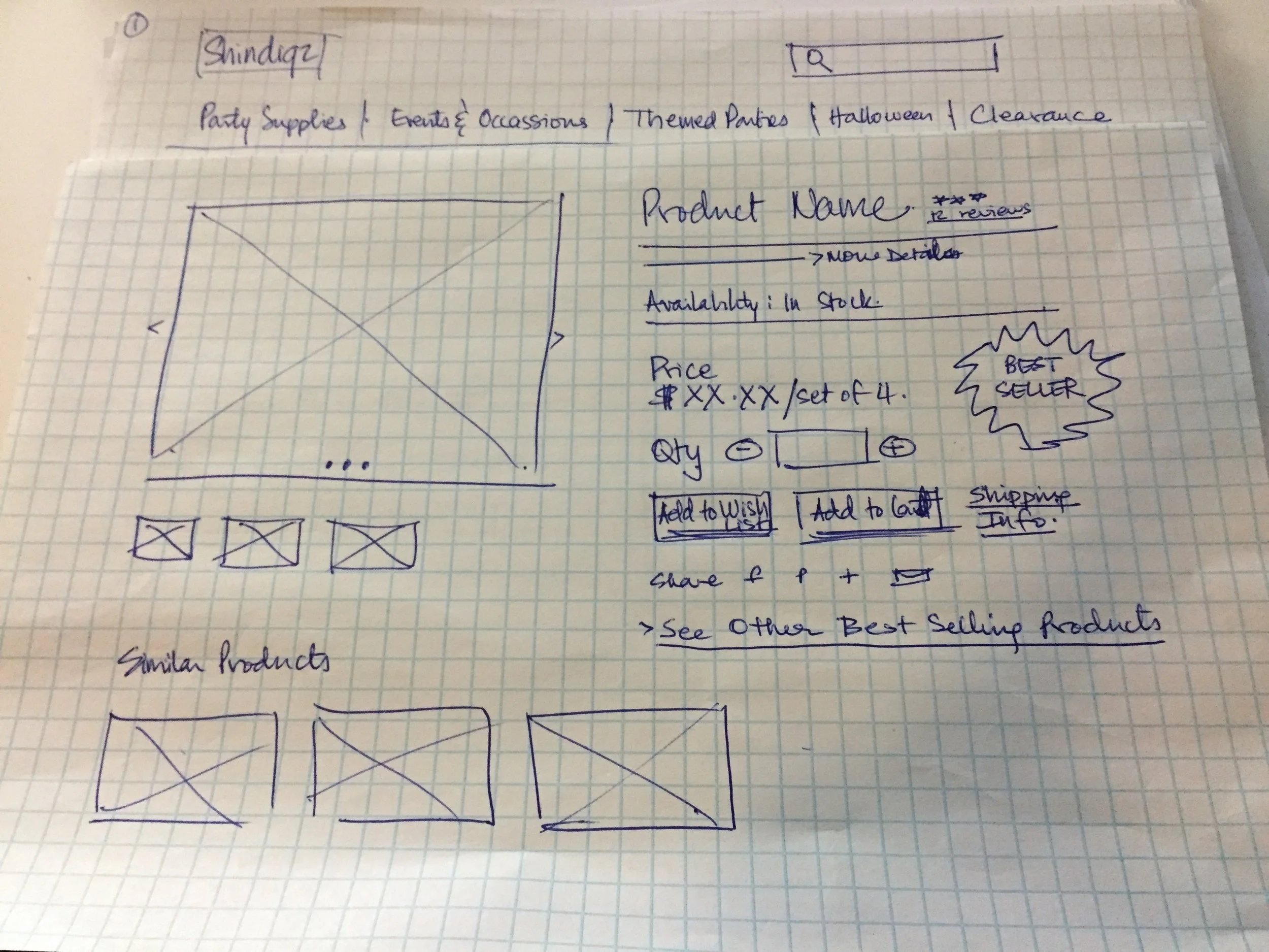
Interactions meeting best-practice and usability standards
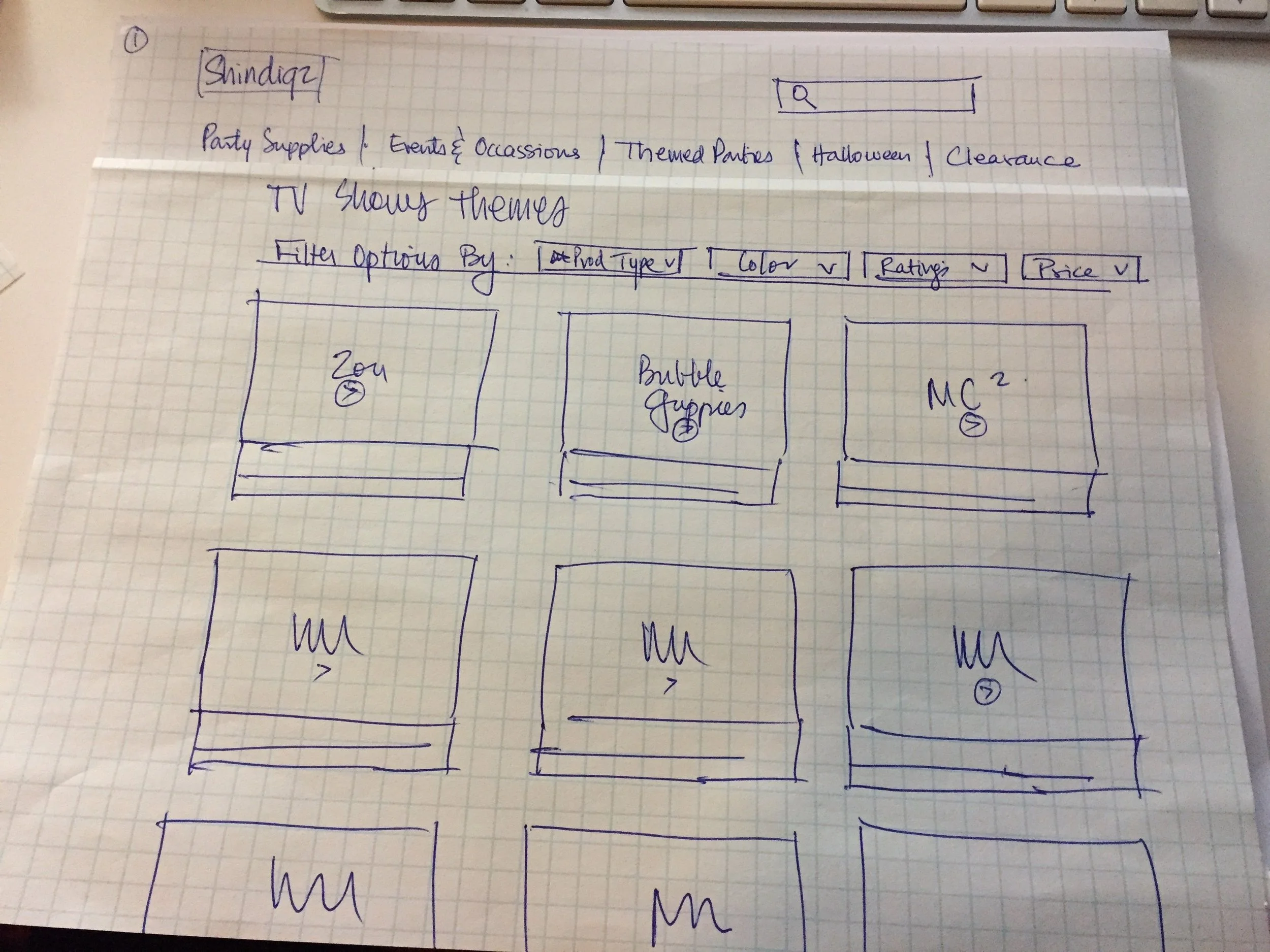
Smart filters to fine tune options based on user needs
Showcase Shindigz's best-in-class party themes and make them easily navigable and exciting, and not overwhelming
Video of clickable prototype
UX PROCESS & artifacts
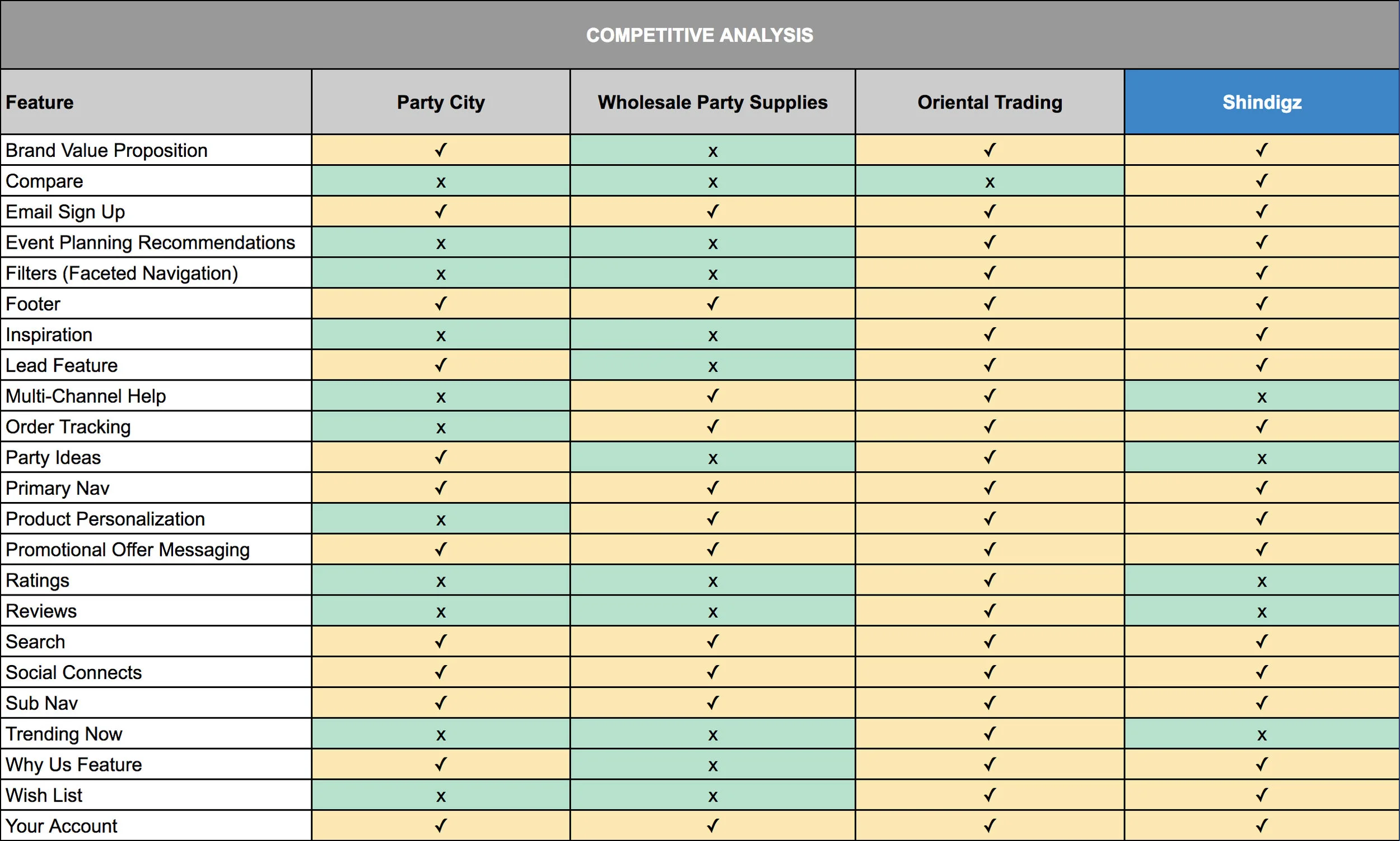
THE COMPETITIVE LANDSCAPE
(Competitive Analysis, Contextual Inquiry, Heuristic Evaluation)
It terms of types of feature offering it revealed a clear market leader—Oriental Trading. I learnt the following through further evaluation of its Heuristics:
Its crystal clear navigation was really easy to use and browse products
The smart filters available allowed the user to narrow options and fine tune among the plethora of options
Contextual Inquiry with users on Shindigz revealed that it stood our as a player with the most unique themes, and 100s of them. This was a clear strength for them. (The A-ha light-bulb moment)
Its important to note here that, Shindigz has lots of features ‘available’, but they have very weak usability or are lacking content in them. A feature’s mere existence does not reflect its absolute success, since that would mislead the user and lead to poor usability and engagement.
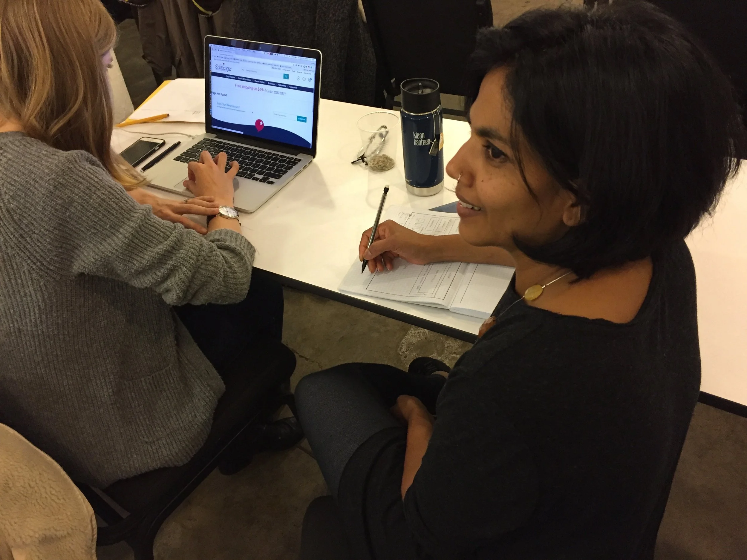
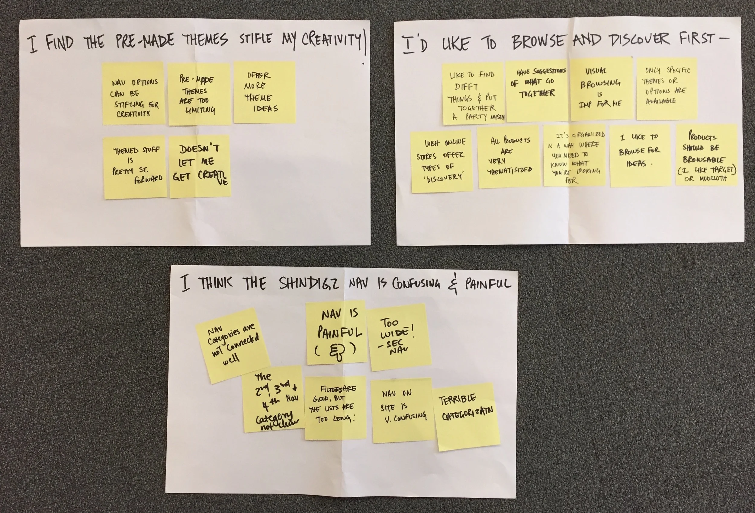
User research
(User Interviews and Affinity Mapping)
Browsing and discovering products to see if it first fits their needs was important to people
The way the products and options were displayed should allow and fuel users creativity
Navigation and site experience to be easy and enjoyable, not confusing and painful
KEY PERSONA – CREATIVE CAITLIN
(Persona Development)
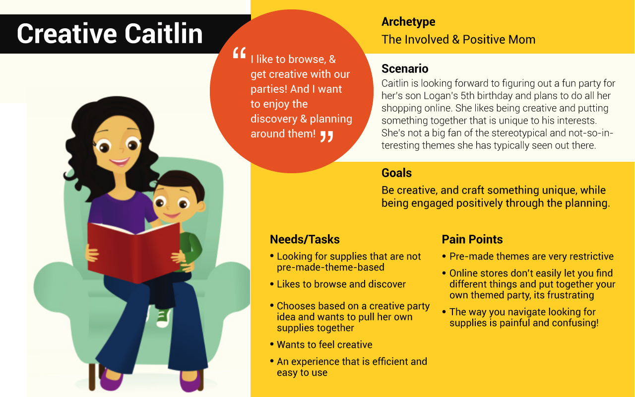
PROBLEM statement
As a person who likes to get creative with my parties (user role)
I want a way to have flexibility in how I discover and decide my party supplies without feeling creatively stifled (task),
So that I can get excited and feel good about my upcoming party (goal)
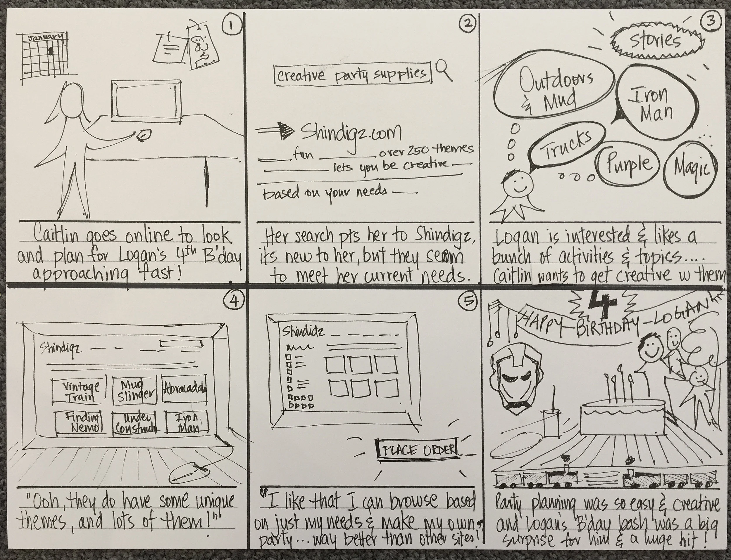
storyboard
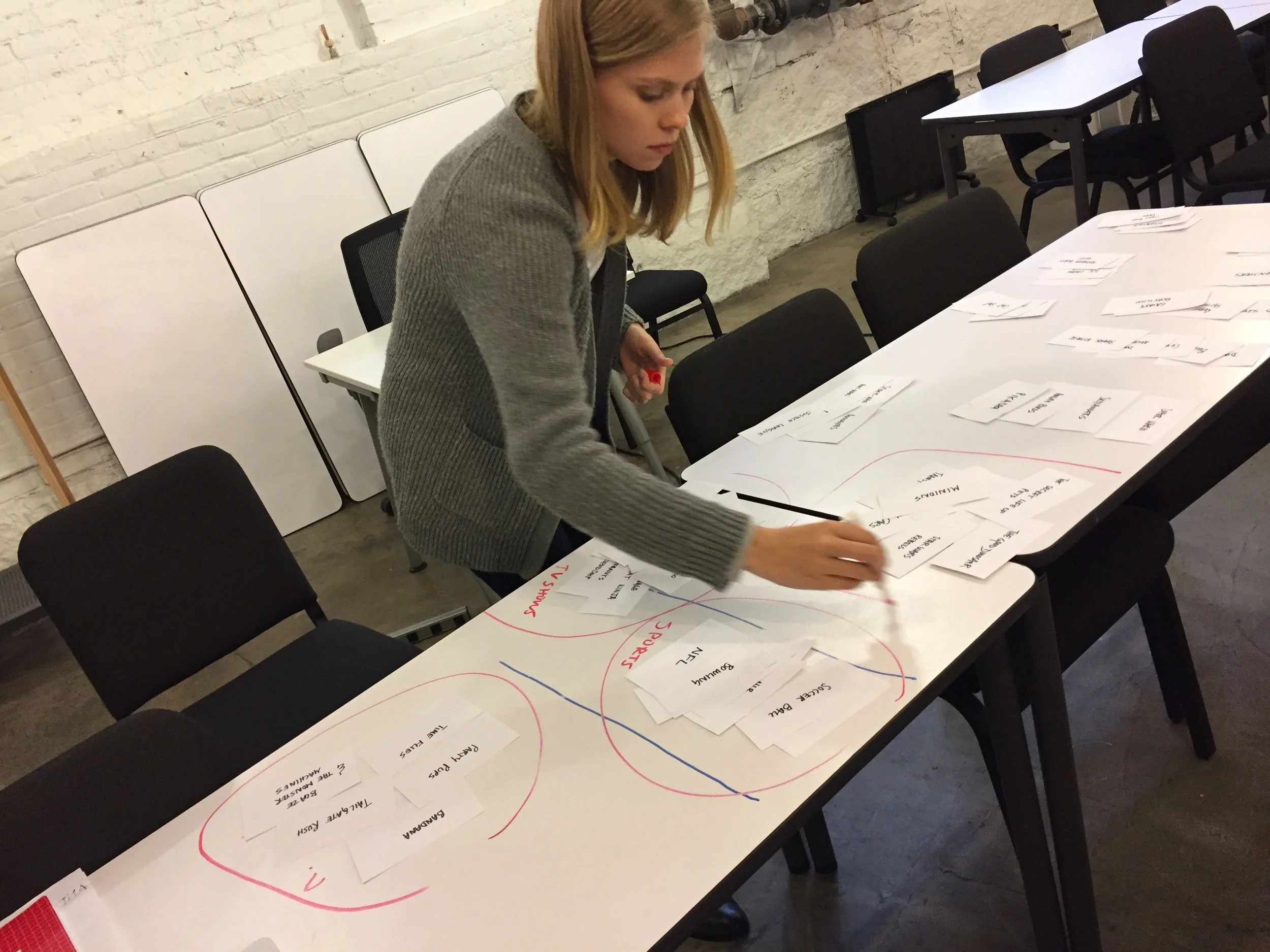
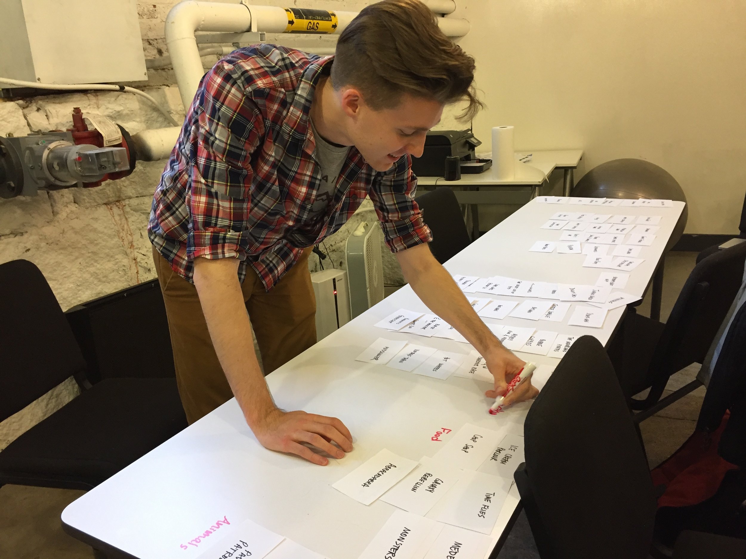
card sorting - to showcase themes effectively
Very satisfying and enlightening indeed
Clear buckets and sub-buckets emanated, although different users applied different ‘labels’ to certain categories
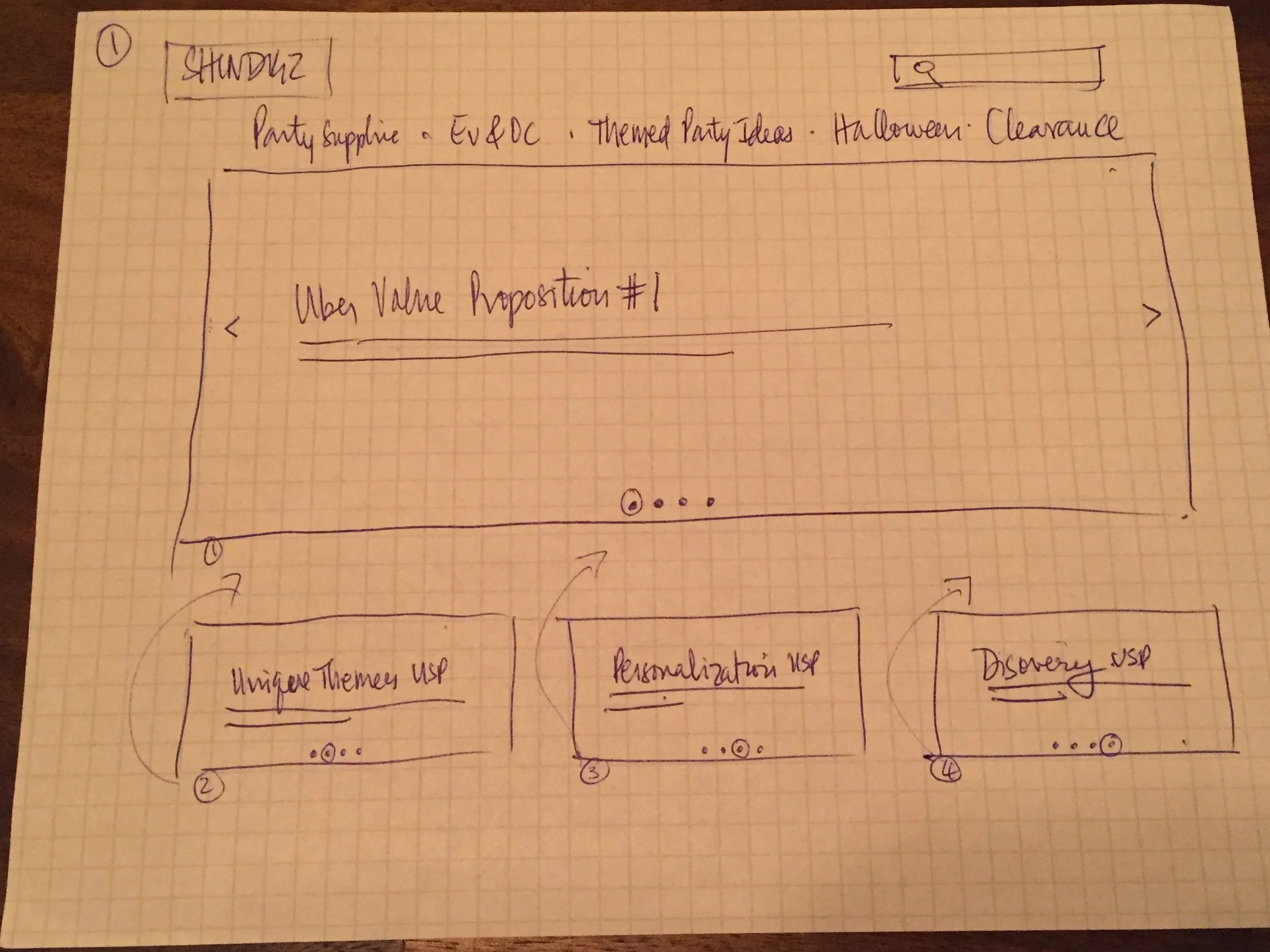
SKETCHES & DESIGN DIRECTIONS
(Home Page Designs)
Always beneficial to explore and test possible design solutions, and then continuing to iterate from testing
TESTING WITH USERS
(Usability Testing)
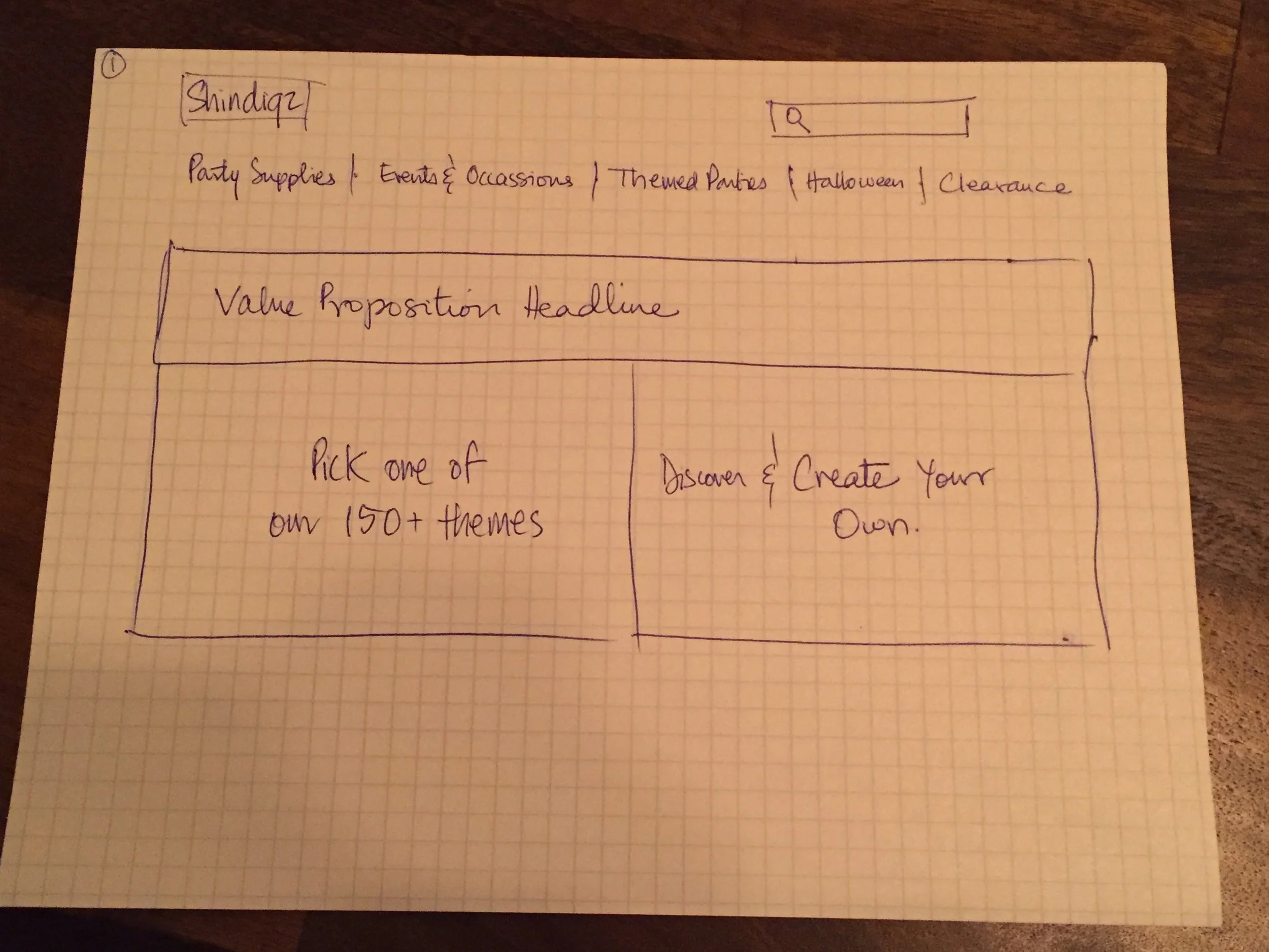
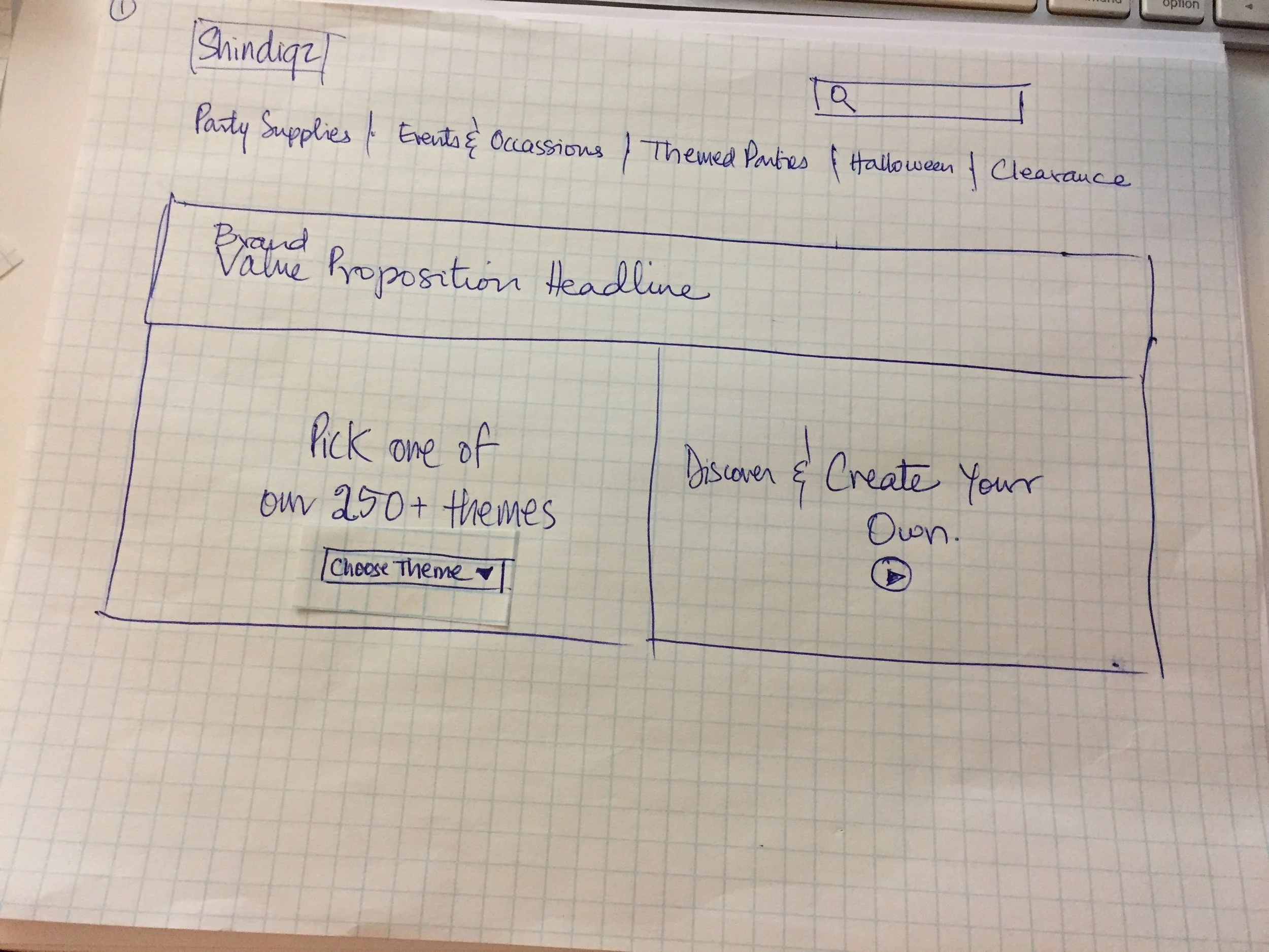
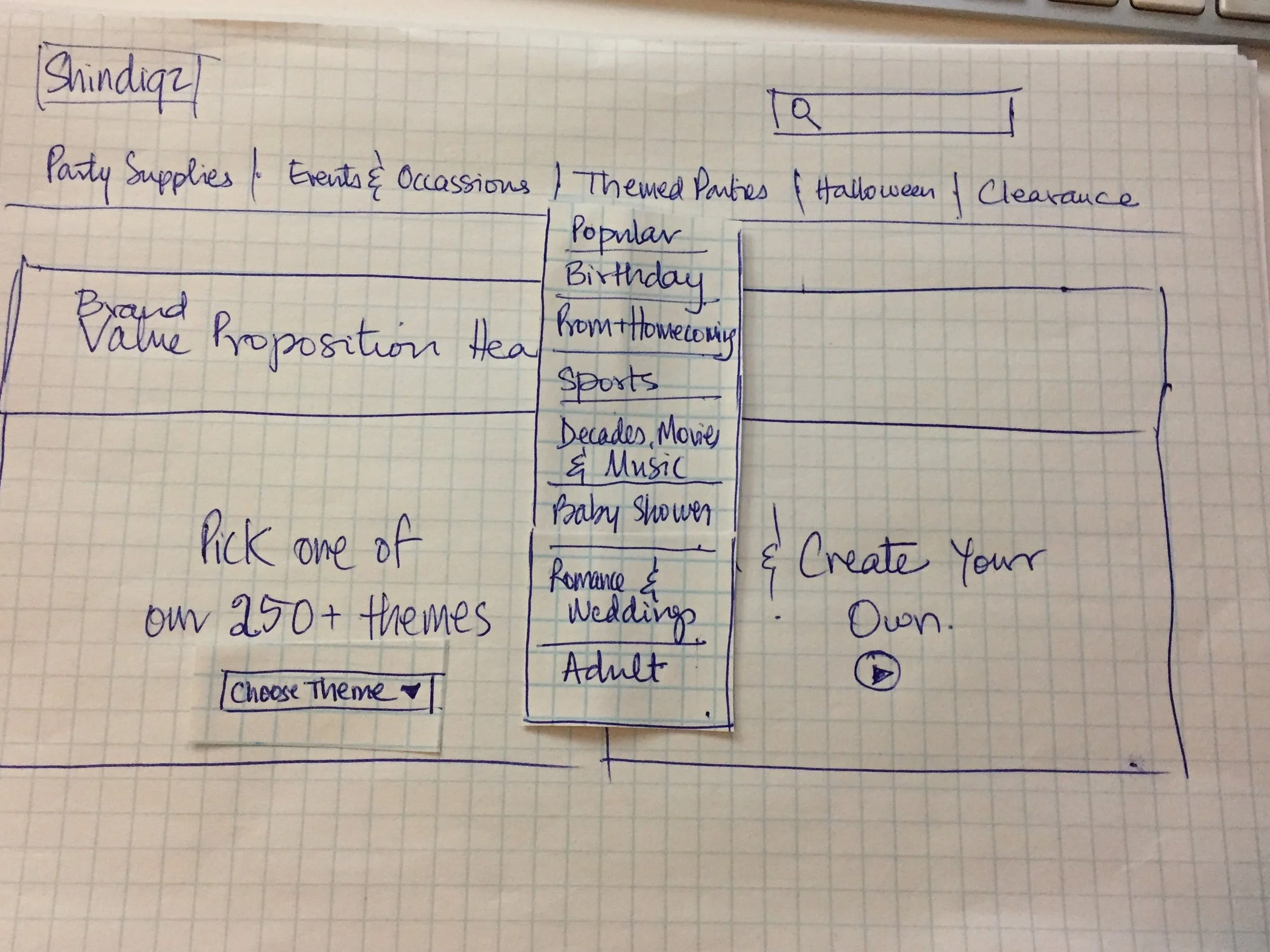
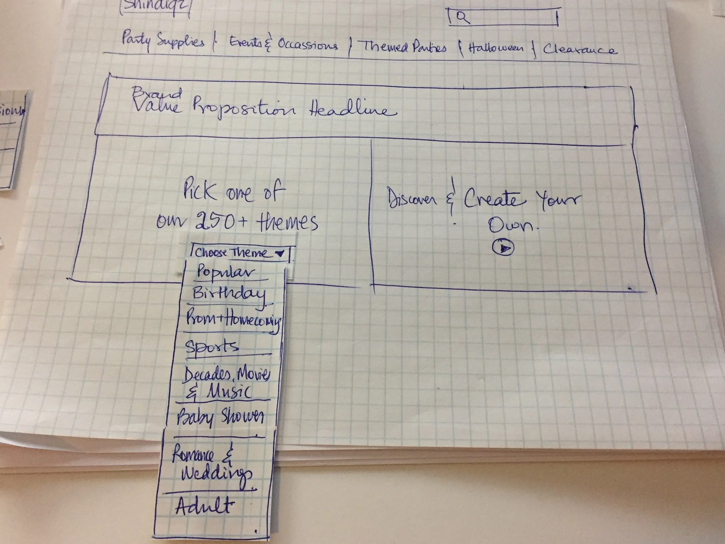
Options 3 above tested best, it had the information that people were looking for and the options were not overwhelming like the 1st one, and not tucked in a carousel like the 2nd one
Users were intriqued by the ‘250+ theme options’ and wanted to engage and browse it first and liked having the ‘Create your own’ theme option
The top level navigation tested very successfully
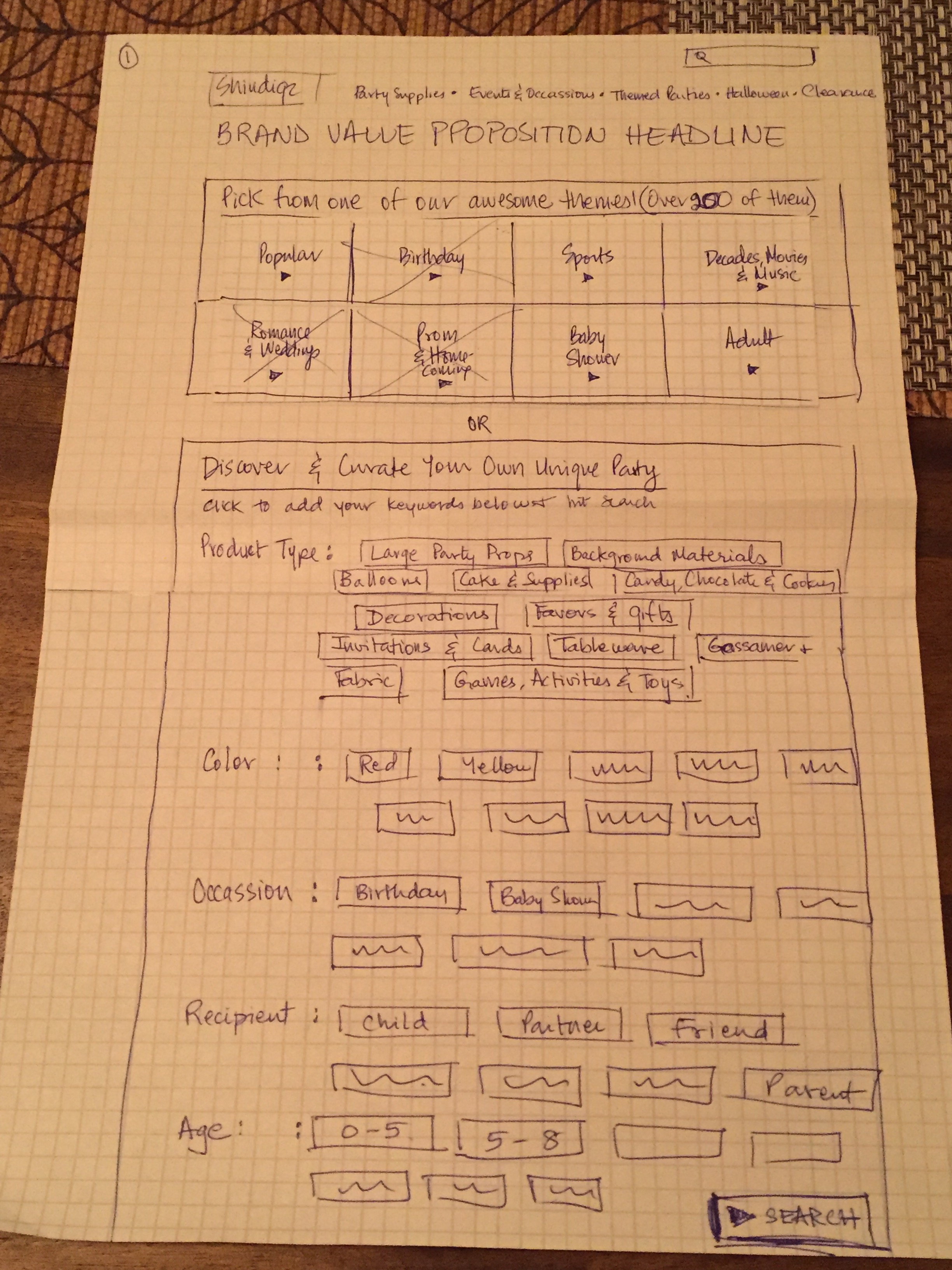
PAPER PROTOTYPES - ITERATION 1 (BASED ON USABILITY findings)
(Lo-fidelity & Medium-fidelity Wireframes)

KEY LEARNINGS
Filters
Further test the filters clusters and order for all pages
Explore the addition of ‘Events and Occasions’ to the the filter
system as well
The collapsed faceted navigation should be investigated and tested
Investigate best practices and other sites who offer is successfully
Breadcrumbing
Test the bread-crumbing pattern currently applied
NEXT STEPS
Undertake Usablity Testing based on most recent learnings
Explore a mechanism to create content for ‘Reviews & Ratings’ by users by offering ‘rewards’ through the loyalty rewards program
Ideate, sketch and test the site experience of ‘creating your own unique them’ for users
Role
UX Design Lead / UX Researcher
TIMEFRAME
2 Week Design Sprint at General Assembly
UX Methodologies
Competitive Analysis, User Interviews, Contextual Inquiry, Usability Heuristics, Affinity Mapping, Information Architecture, Business and Brand Goal Evaluation, Persona Development, Storyboard, Sketching, Card Sorting, Design Direction Ideation, Paper Prototyping, Usability Testing, Design Iterating, Wireframing, Prototyping.