Design goal
design an interface for data curators to capture and validate cancer patient data using natural language processing
PROBLEM TO SOLVE:
Dana Farber Cancer Institute lacked a well-structured database of patient clinical data and workflow process that would allow them to do the types of research they'd like to do across their patients.
Outcomes
The design and workflow of a Data Abstraction Tool which leveraged natural language processing.
2 Hi-fi prototypes were designed and tested, both having high acceptance rates.
One prototype was chosen due its perceived ability to be able to accommodate more types of patient data across departments over time.
Extremely pleased clients taking the results and prototype to design and inform the Dana Farber's Data Abstraction Tool.
High-FIDELITY Prototype
UX Process & artifacts
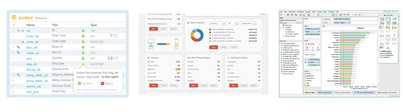
THE COMPETITIVE LANDSCAPE
(Competitive Analysis)
We looked at other User Interface designs that were effectively organizing and manipulated large data sets and data types
Positive design aspects were noted on all of them to help inform the design of POD
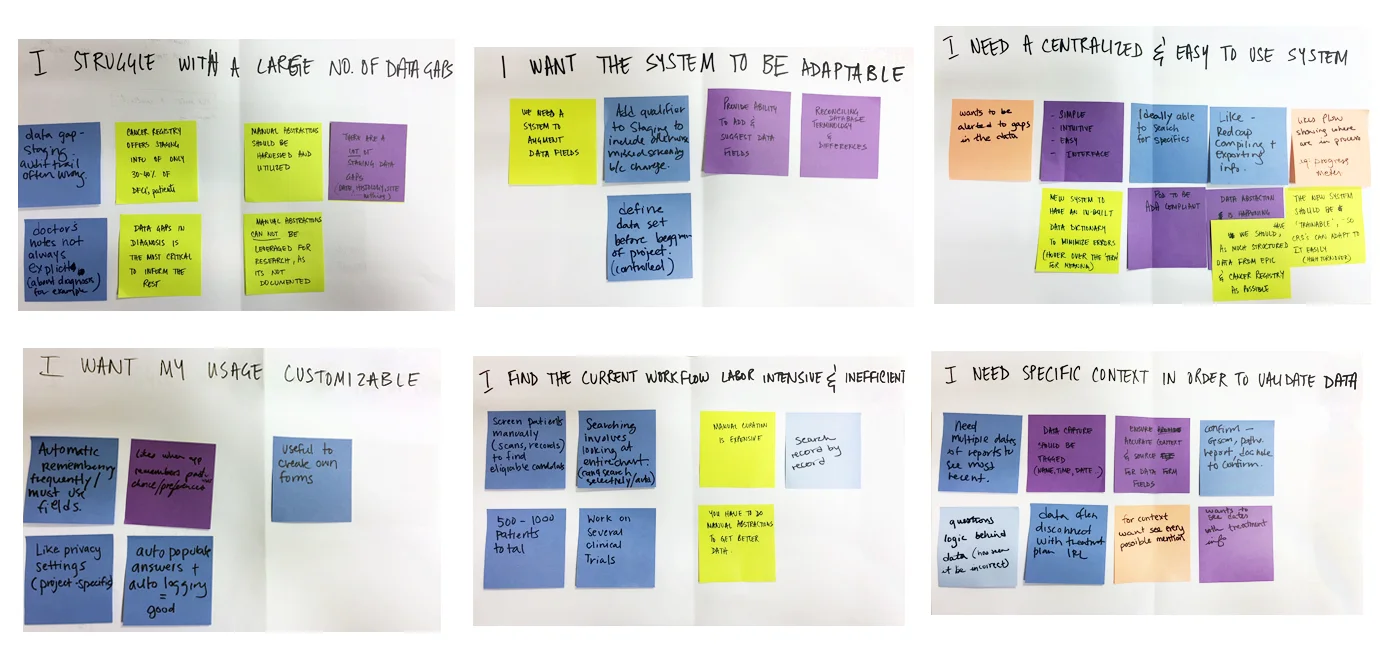
User research
(User Interviews and Affinity Mapping)
Data curators found their current workflow labor-intensive and inefficient
They struggled with large number of data gaps and needed the necessary context in order to validate patient data
An easy-to-use centralized system that could advance with their needs was top of mind
A customizable app was a key feature that they seeked too.
KEY PERSONA – CREATIVE CAITLIN
(Persona Development)
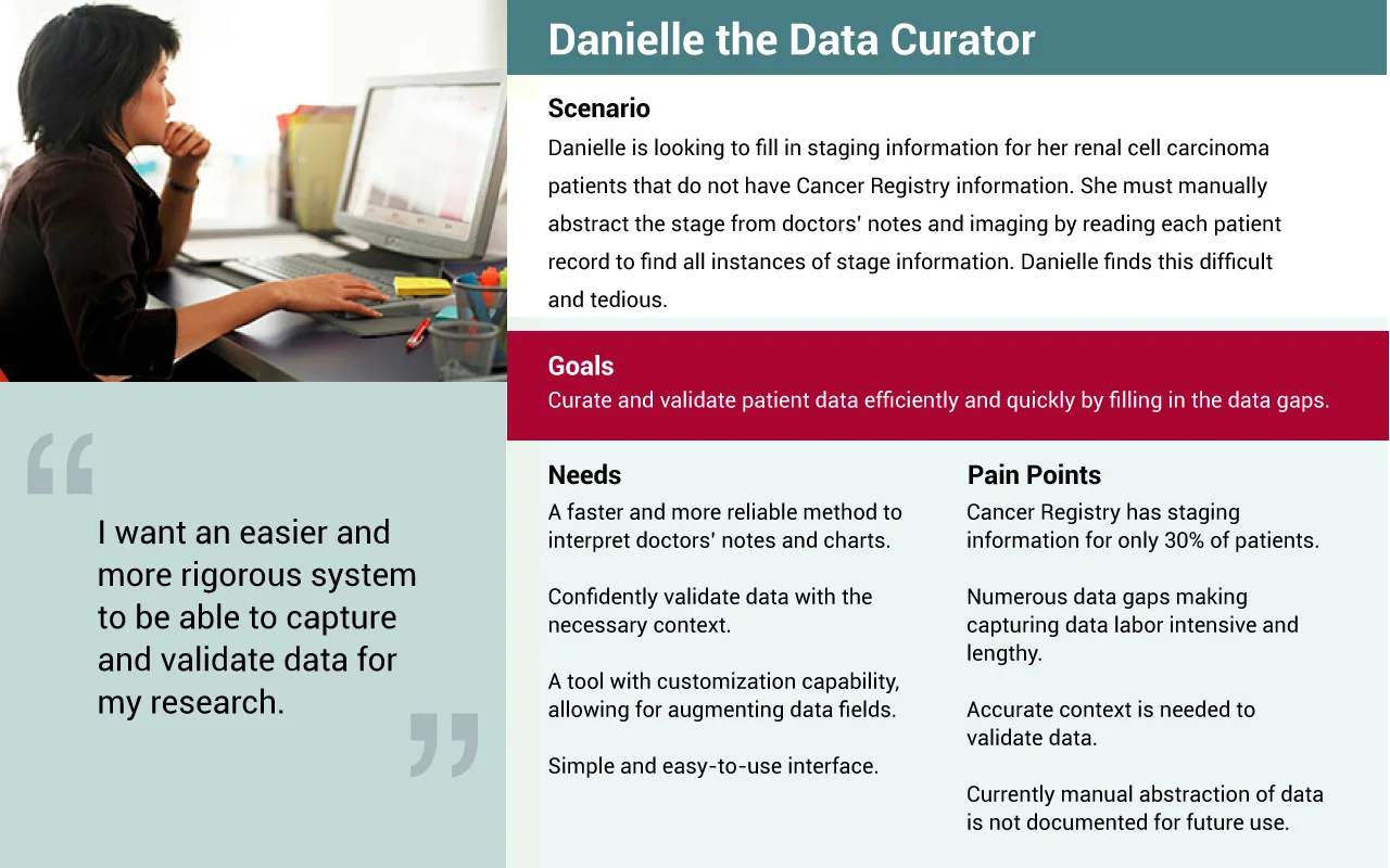
PROBLEM statement
As a data curator (user role)
I need a system that will let me efficiently capture and validate data, (Task)
So that patient data can be effectively abstracted for the benefit of medical research.(goal)
storyboard
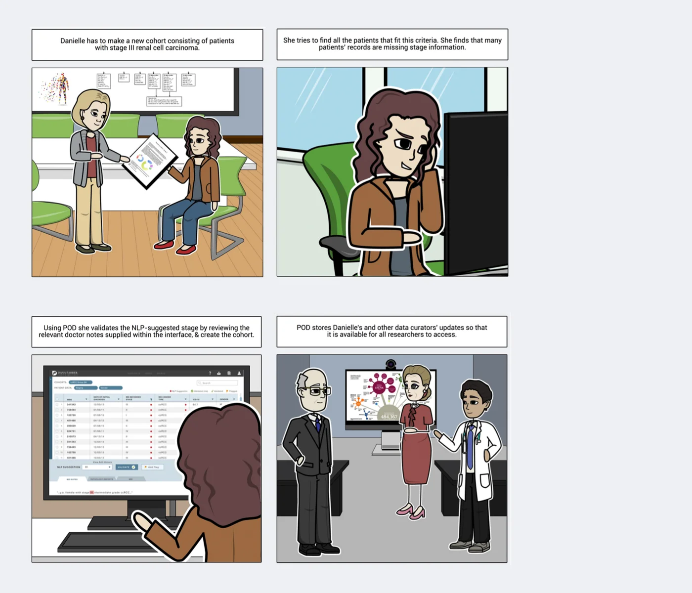
SKETCHING
We explored various approaches to the interface designs that meet users' needs
Different interactive formats such as tabular, drag and drop, fluid systems, and faceted navigation of presenting data were sketched up to see what might be most successful
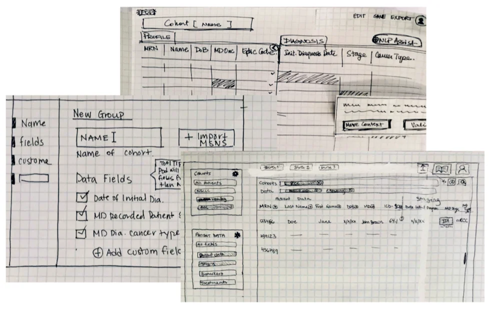
Paper prototype
Users tested with a detailed paper prototype that took them through the design of POD
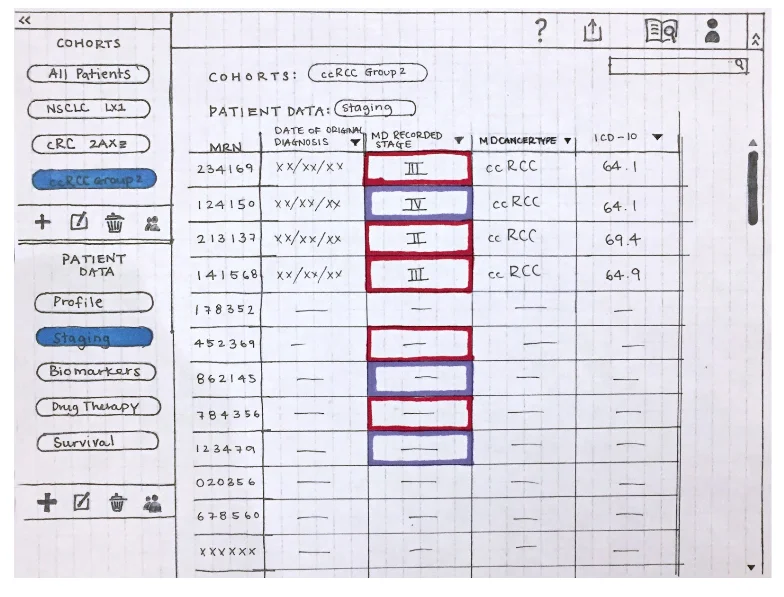
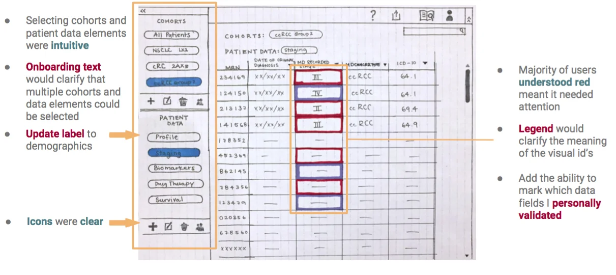
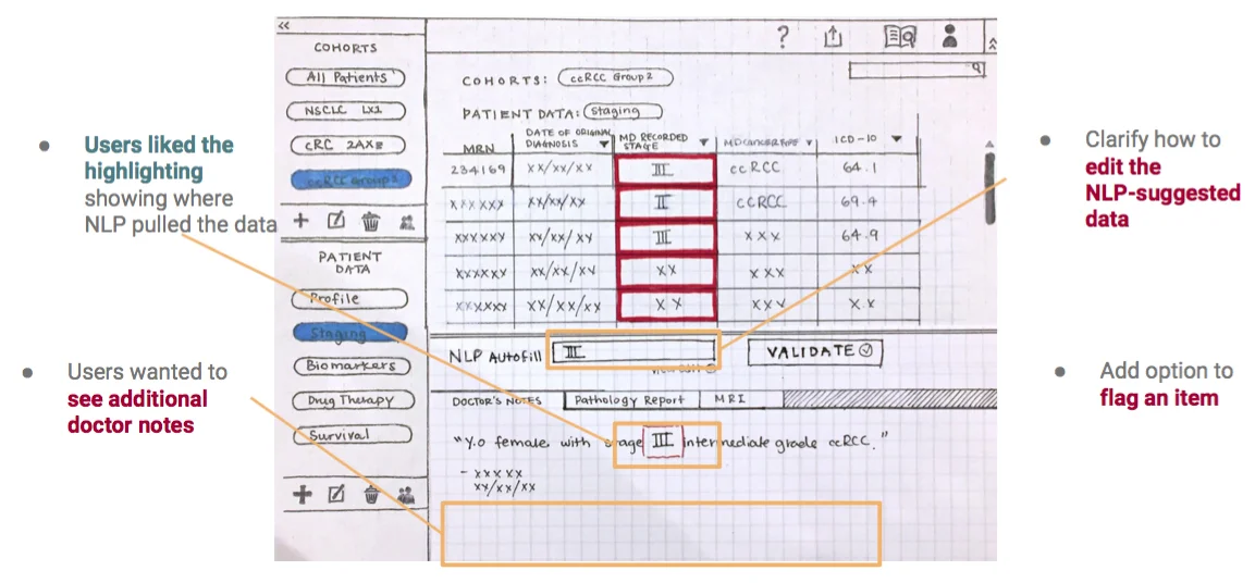
user testing
It tested really well with users, and most aspects of it worked successfully (items highlighted in green below) and there were some items that needed to be revisited (listed in red below)
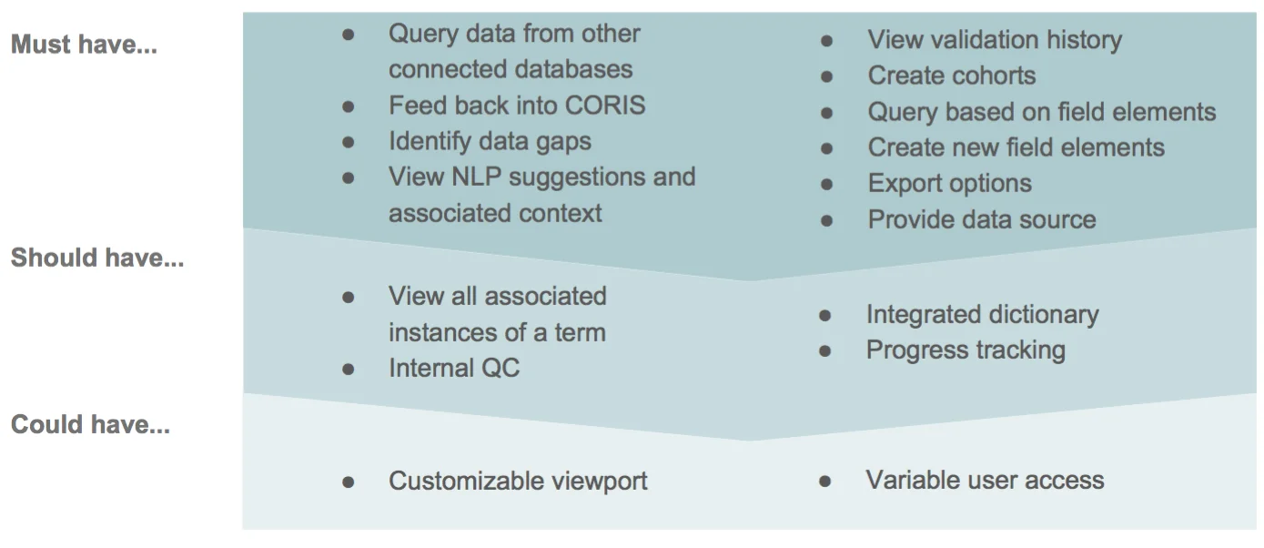
FEATURE PRIORITIZATION - MOST VIABLE PRODUCT (MVP)
A look at how the product launch can be phased out in terms of features, starting wit the 'must have' set, and then layering up the other sets.
HI-FI PROTOTYPES
Two version of the hi-fidelity were developed that presented the work flow and visual style in different ways, seen below are Version A (with yellow strip), and Version B (monochromatic)
Both tested effectively, and a slight majority of users preferred Version B due to its omnipresent legend and the format of the data set selection process.
Items that needed to be addressed within Version B:
Design be ADA compliant
Label verbiage clarified
Filter dropdown to be revised
Workflow reflined to address editing of cohorts and creation of custom patient data fields
Allowing users to edit only within a closed set of options within the validation panel
Version A
Version B
Final Interactive Prototype
View the interactive prototype here: https://invis.io/RVGLQXLAM53
NEXT STEPS
• Explore how to incorporate machine learning by gathering feedback from current users
• Include label hovers and tool-tips for clarification
• Build out additional screens to support the workflow, such as importing MRNs (Medical Record Numbers)
• Accommodate power users with large number of cohorts and patient data sets
• Continue to refine the visual design
• Continue to test and revise the interactivity and workflow
Role
UX Designer / Researcher in a team of 3. My key contribution was to bring big picture thinking of how the design of this app could influence other design systems internally, and also pushing the design of POD's framework to evovle and accommodate the growing needs of the Research Team at Dana Farber. I also heavily pushed and influenced the visual design of the app, and designed Version A of the app.
TIMEFRAME
3 Week Design Sprint
UX Methodologies
Competitive Analysis, User Interviews, Affinity Mapping, User Flows, Information Architecture, Persona Development, Storyboard, Mood Board, Sketching, Card Sorting, Design Direction Ideation, Paper Prototyping, Usability Testing, Sitemap, Design Iterating, Wireframing, Hi-Fi Prototyping.